Last updated July 11, 2025
Complex images contain more information than can be conveyed in alternative text. This guide provides examples of how to present information from complex images such as charts, data visualizations, maps, and other graphics in formats that are accessible to sighted users as well as people with low or no vision. Offering multiple formats allows people to access content in different ways, improving accessibility and supporting the principles of universal design.
Image descriptions
Image descriptions, also called long descriptions or text descriptions, are the most basic alternative format for making a complex image more accessible. When writing image descriptions, include the content and context of the image as it relates to the subject matter. Image descriptions, also called long descriptions or text descriptions, are the most basic alternative format for making a complex image more accessible. They provide vital access for low vision or blind people, and give sighted people multiple formats to support their understanding of content.
Include image descriptions in the main copy of your website or course materials, or include a link to a longer description. By including image descriptions in the main copy of your content, the user doesn’t have to navigate to another page and lose their spot in the original content. Linking to a separate page for an image description makes the description a little less discoverable, but it can be useful if you have space or character constraints in your resource. Either way, include the location of the longer description in the alt text for the image.
In the first example, the caption under a textbook diagram provides an image description for an illustration.
Figure 3: Velocity profile
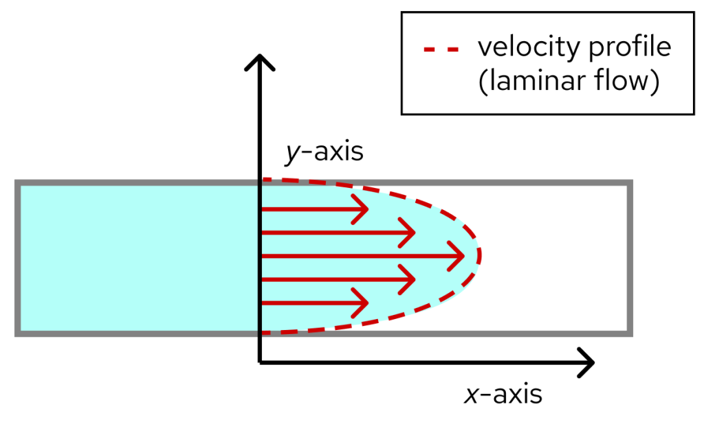
Fig 3: This illustration shows fluid flowing through a pipe along the x-axis in parallel layers with minimal disruption. Velocity arrows are shorter on the edges, representing a slower velocity vx and longer in the center, representing a faster velocity. The edges of the arrow form a parabola and represent the velocity profile.
The next example demonstrates how to use a link to direct people to another page for an image description. The alt text for the image also includes a reference to the location of the full image description.
Figure 3: Velocity profile

Data tables and summaries
Sometimes an image conveys a lot of data that would be difficult to fully describe, particularly when including images like charts, graphs, or data visualizations. In this case, it may be appropriate to share data in a table or spreadsheet that makes it easier for users to explore. Similarly to image descriptions, use alt text for the image to share the location of the data table or summary.
The following example comes from the WebAIM Screen Reader User Survey, and shows responses about the usefulness of heading levels in web page navigation.
Heading levels
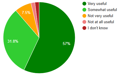
When navigating a web page by headings, how useful are the heading levels (e.g., “Heading 1”, “Heading 2”, etc.) to you?
| Response | Number of respondents | Percent of respondents |
| Very useful | 855 | 57.0% |
| Somewhat useful | 477 | 31.8% |
| Not very useful | 113 | 7.5% |
| Not at all useful | 27 | 1.8% |
| I don’t know | 29 | 1.9% |
AI for image descriptions
Many generative AI tools can process images and create descriptions, including UW–Madison’s enterprise generative AI tools. When writing prompts for AI tools to start generating descriptions of complex images, include:
- A brief description of the image, such as, “illustration of the four chambers of the heart” or, “bar graph of monthly website visitors.”
- The format in which you would like the description, for example, a paragraph or an outline.
- Explicit instruction for describing detail, such as “using all of the text in the image,” or “using the descriptions from the legend.” This will instruct the AI to not just identify the steps, but describe them using the specific labels provided to visual without making assumptions based on outside sources.
The most common barriers created by AI image descriptions are inaccurate or incomplete descriptions of the information represented, and unnecessary descriptions of visual details when the meaning of the visual cue is the important information. We must edit AI-generated descriptions for accuracy and clarity before adding them to digital content to ensure truly equal access.
Example
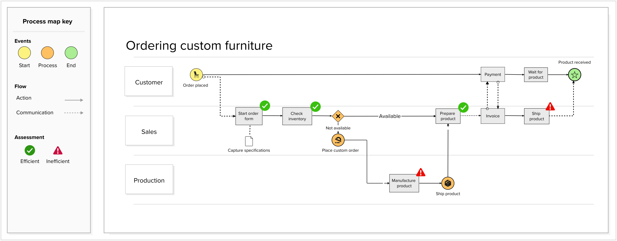
We asked Google Gemini to describe a flowchart representing the process of ordering custom furniture with the following prompt:
Create an outline of this process map for ordering custom furniture. Describe the steps in the process based on the information in the process map key.
I can help you with that! Here’s an outline of the process map for ordering custom furniture, based on the provided image and its key:
Process Map Outline: Ordering Custom Furniture
This outline describes the steps involved in ordering custom furniture, as depicted in the process map. The process involves three main participants: Customer, Sales, and Production.
Process Map Key:
- Events:
- Yellow Circle: Start
- Green Circle: Process
- Red Circle: End
- Flow:
- Solid Arrow: Action
- Dashed Arrow: Communication
- Assessment:
- Green Checkmark: Efficient
- Red Exclamation Mark: Inefficient
I. Customer Initiates Order
- Start Event: Order placed (Yellow Circle)
- Assessment: Efficient (Green Checkmark)
II. Sales Department Processes Order
- Capture Specifications: Sales starts the order form and captures the customer’s specifications.
- Assessment: Efficient (Green Checkmark)
- Check Inventory: Sales checks if the product is available in inventory.
- Assessment: Efficient (Green Checkmark)
- Decision Point: Is the product available?
- If Available:
- Prepare Product: Sales prepares the product.
- Assessment: Efficient (Green Checkmark)
- Prepare Product: Sales prepares the product.
- If Not Available:
- Place Custom Order: Sales places a custom order with Production.
- Assessment: Inefficient (Red Exclamation Mark)
- Communication: Sales communicates to Production to manufacture the product.
- Place Custom Order: Sales places a custom order with Production.
- If Available:
III. Production Manufactures Product (if not in inventory)
- Manufacture Product: Production manufactures the custom furniture.
- Assessment: Inefficient (Red Exclamation Mark)
- Ship Product (from Production): Production ships the manufactured product.
- Assessment: Inefficient (Red Exclamation Mark)
IV. Sales Completes Financial and Shipping Steps
- Invoice: Sales creates and sends an invoice to the customer.
- Assessment: Efficient (Green Checkmark)
- Communication: Sales communicates payment request to the customer.
- Payment: Customer makes the payment.
- Assessment: Efficient (Green Checkmark)
- Ship Product (from Sales): Sales ships the product to the customer.
- Assessment: Inefficient (Red Exclamation Mark)
- Communication: Sales communicates to the customer to wait for the product.
V. Customer Receives Product
- Wait for Product: Customer waits for the product to arrive.
- Assessment: Efficient (Green Checkmark)
- End Event: Product received (Red Circle)
- Assessment: Efficient (Green Checkmark)
The AI-generated description contained some accessibility barriers, including inaccurate information and unnecessary details about the visual layout. To improve the description, we:
- Corrected inaccurate information, such as the description of a green checkmark on the Start Event.
- Removed unnecessary details, such as the visual description of the key and the colors throughout the process map.
- Adjusted the formatting of the outline for clarity
Process Map Outline: Ordering Custom Furniture
- Customer Initiates Order
- Start Event: Order placed
- Sales Department Processes Order
- Capture Specifications: Sales starts the order form and captures the customer’s specifications.
- Assessment: Efficient
- Check Inventory: Sales checks if the product is available in inventory.
- Assessment: Efficient
- Decision Point: Is the product available?
- If Available:
- Prepare Product: Sales prepares the product.
- Assessment: Efficient
- Prepare Product: Sales prepares the product.
- If Not Available:
- Place Custom Order: Sales places a custom order with Production.
- Assessment: Inefficient
- Communication: Sales communicates to Production to manufacture the product.
- Place Custom Order: Sales places a custom order with Production.
- If Available:
- Capture Specifications: Sales starts the order form and captures the customer’s specifications.
- Production Manufactures Product (if not in inventory)
- Manufacture Product: Production manufactures the custom furniture.
- Assessment: Inefficient
- Ship Product (from Production): Production ships the manufactured product.
- Assessment: Inefficient
- Manufacture Product: Production manufactures the custom furniture.
- Sales Completes Financial and Shipping Steps
- Invoice: Sales creates and sends an invoice to the customer.
- Assessment: Efficient
- Communication: Sales communicates payment request to the customer.
- Payment: Customer makes the payment.
- Assessment: Efficient
- Ship Product (from Sales): Sales ships the product to the customer.
- Assessment: Inefficient
- Communication: Sales communicates to the customer to wait for the product.
- Invoice: Sales creates and sends an invoice to the customer.
- Customer Receives Product
- Wait for Product: Customer waits for the product to arrive.
- Assessment: Efficient
- End Event: Product received
- Assessment: Efficient
- Wait for Product: Customer waits for the product to arrive.
Other formats
Text alternatives are the most common and widely supported way to make visual content accessible. They’re easy to create, simple to maintain, and work with many different assistive technologies.
Depending on your content, audience, and available resources, you might also explore other formats. Tactile formats—like Braille or raised-line graphics—allow people to access information through touch. Audio formats can also bring visuals to life, from spoken image descriptions to sonification, which uses changes in sound (like pitch or tone) to represent changes in data. These alternative formats can help make complex visuals more inclusive for a wider range of users.
Accessible visual elements
In addition to providing text based alternatives for complex images, there are some best practices that can help make the visual elements of charts, data visualizations, and other complex images more accessible. Using colors with high contrast, multiple visual indicators, and clear labels can help make your complex images easier to interpret for a wide range of people.
Use of color
The colors we use in charts, graphs, and other complex images can help highlight key data and guide people’s attention. If the colors we choose don’t have enough contrast or we rely only on color to show meaning, some people might not be able to access or interpret that data. By making thoughtful choices about color and spacing, we’ll help more people understand our data.
The following image is an example of a system status tracker, using green, yellow, and red to indicate status.

The following image shows the same system status tracker, but how it would look with deuteranomaly, the most common type of red-green color vision deficiency.

To make visualizations more accessible, choose color combinations that stand out clearly from each other and from the background. In addition to using color, consider using another visual indicator like patterns and icons to communicate information, and use borders or spacing between elements to help separate areas of your chart without relying only on color.
The following image still uses green, yellow, and red to indicate status, and also uses a star, ellipses, and exclamation point icon to communicate the information.
![]()
The following image shows the same system status tracker with colors and icons, but how it would look with colorblindness.
![]()
Here are a few ways to check and improve color contrast in your data visualizations:
- Use a color contrast checker to make sure your colors meet WCAG requirements:
- Text should have a contrast ratio of at least 4.5:1
- Other important visuals, like chart bars or lines, should have a contrast ratio of at least 3:1
- Use a color blindness simulator to see how your design looks for people with different types of color vision
Labels and descriptions
A clear title and short description of your visualization can help people quickly understand the purpose of the visualization and what information they should pay special attention to. Include a title and short description before the data visualization in the content order. In the description, briefly explain what the data is conveying or how it relates to the surrounding content, and point people toward longer descriptions or data summaries if available.
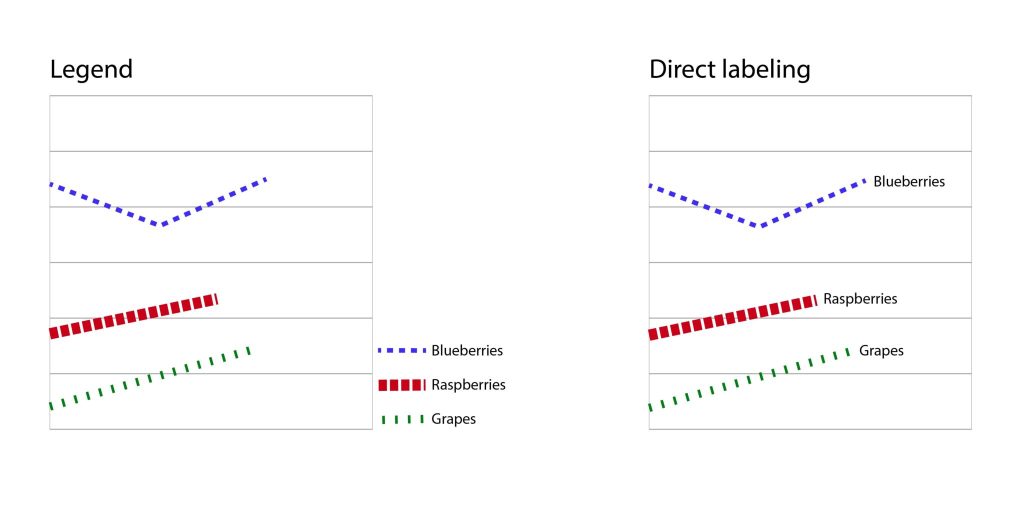
Another way to describe content in a visualization is through labeling the different elements and measurements. Whenever possible, label data directly instead of making people rely on a key or legend to understand what different visual elements represent. Having data labeled in context can make the information more accessible in a variety of ways, including reducing the cognitive load on the audience and providing visual cues in addition to color. The following image shows the difference it makes when data is directly labeled in a chart.
The Center for User Experience
At the Center for User Experience, we are committed to working with you to make digital spaces more accessible, usable and inclusive for all students, faculty and staff at UW–Madison. We help the university follow its Digital Accessibility Policy by offering free evaluation and consultation services to all UW–Madison community members. For guidance on complying with digital accessibility requirements, visit Digital accessibility and the Americans with Disabilities Act (ADA).
Get in touch
- Meet with us: Book an office hours chat with one of our team members to ask any questions you have.
- Start a project with us: We support accessible design and development. Fill out our Let’s Connect form to begin working with us on your project or to request an accessibility evaluation.
- Email us: Not sure if you’re ready to meet? Email us to start talking and figure out what to do next.