Elevating web app experience for students
UX design
Accessibility
Timeline: 6 months
Tool: Figma
Project goals and scope
The application, Preparing for SOAR, helps advisors with better access to student information prior to their advising sessions with students during SOAR. The students answer questions about their interests, intended majors if any, and test scores. The Center for User Experience (CUE) partnered with the campus to create more usable and accessible digital experiences.
Project goals
The goal of this project is to refresh the front end of the Preparing for SOAR application in alignment with back-end updates.
This effort aims to modernize the interface, enhance the overall user experience, and improve accessibility, while aligning the design more closely with the UW–Madison style guide.
Project scope
The Center for UX collaborated with the TRAD team to:
- Create wireframes to improve usability and accessibility
- Support the development team in implementing the refreshed front-end design
- Conduct accessibility evaluations and assist in resolving identified barriers
Methodology
Blueprint
We developed a UX blueprint to visualize how the different applications and touch points connect from the user’s perspective. This helped ensure consistency in language, interactions, and expectations across the various stages of the SOAR user journey.
Design and development support
We designed wireframes with a focus on improving usability and accessibility, aligning with modern UI standards, the UW–Madison style guide, and user needs. Throughout the implementation process, we closely collaborated with the development team to support the implementation of the updated front-end design.
Accessibility
We conducted a comprehensive accessibility evaluation of the redesigned application using both automated and manual testing methods. This included keyboard navigation testing, screen reader compatibility checks, magnification testing, and color contrast analysis, ensuring compliance with accessibility best practices and standards. We also assisted in resolving identified barriers with the developer team.
Design
Information architecture
Original IA flow (Before):
- Advising Page
- AP Scores
- IB Scores
- Transfer Courses
- Summary Page
Updated IA flow (After):
- Welcome Page (including Advising information)
- Combined Scores Page: AP Scores, IB Scores, A-Level/CLEP
- Transfer Courses
- Interests and Additional Information (new page)
- Summary Page
Enhanced Entry Point:
- The Welcome page replaces the original Advising page. The old version only displayed advising group information, e.g., School of Business; in contrast, the new version adds clear guidance about how the system works and what users will be asked to provide.
Consolidated Score Entry:
- The AP, IB, and A-Level/CLEP inputs are now consolidated into one page, reducing the number of pages and streamlining navigation and transitions.
New Section Added:
- A dedicated Interests and Additional Information page was added to capture more advising-relevant information. It invites students to share about themselves to help advisors prepare better.
The updated IA creates a clearer, more streamlined and informative user journey and helps advisors gather more relevant context before the advising activities.
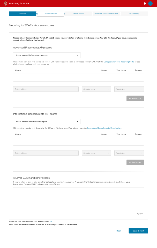
Here are some design examples:
Before: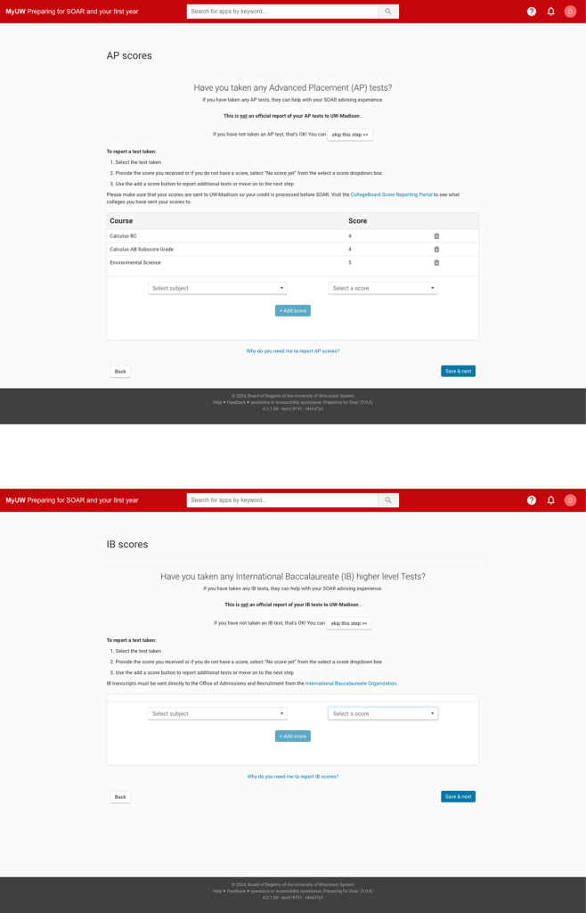
After: