Elevating the web app experience for students and advisors
Project goals and scope
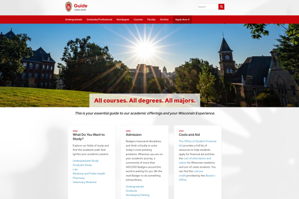
The Center for User Experience partnered with representatives from the Guide’s Lumen team in the spring 2024 to improve the structure of content and the usability of Guide (guide.wisc.edu).
Project goals
Improve the content strategy and usability of Guide’s:
- Home page
- Undergraduate landing page
- Program pages
In addition:
- Understand how people use Guide
- Answer students’ and advisors’ questions
- Identify the content that could life elsewhere
- Organize information to improve findability
Project scope
- Improve content so that it’s more readable, user-friendly
- Use plain language writing for web content
- Design a more usable and useful Guide, balancing important and promotional information
- Project sponsors emphasized that Guide needs to be the single source of truth.
Methodology
Heuristic evaluation
Our team evaluated the design of Guide against Jakob Nielsen’s 10 usability guidelines to identify problems in the interface. Based on this evaluation, we made recommendations to: increase font size to improve readability, improve link interaction for a more intuitive and efficient experience, eliminate extraneous features and content to improve readability, and improve UX language for consistency and reducing cognitive load.
Interviews with students and advisors
Our team scheduled conversations with 8 undergraduate advisors and 5 undergraduate students to understand how they search for information in Guide and what that experience is like for them, which features and content are most and least useful, and how Guide supports their own or their advisees’ course and degree planning.
Survey
We developed a survey to gather insights on respondents’ website usage and satisfaction. 94 students, advisors and staff responded. Respondents shared that they use guide frequently and find it valuable, however, they don’t always trust if the information is up to date and have difficulty understanding the major and course requirements for their or their advisees.
Design / wireframes
We designed wireframes for a new home/landing page and the Undergraduate landing page. We also developed recommendations for a program page. The focus was to make the content easily navigable and simple to understand.
Accessibility
We evaluated Guide using automated and manual testing methods including keyboard testing, screen reader testing, magnification testing, and color contrast testing. Screen reader and keyboard barriers may make it difficult for people with visual disabilities and motor disabilities, respectively, to navigate the website.
