Last updated April 2025
Make your websites and apps accessible so everyone can use them easily, including people with disabilities. Focusing on accessibility from the beginning creates digital experiences that more people can use. This approach helps you follow web standards and reach a wide audience.
Quick tips
1. Learn the fundamentals
You need to follow the same core steps for accessibility regardless of your content’s format. This fundamentals guide gives you the basics to get started.
2. Interaction design
Ensure all website content and controls are accessible to all users with clear keyboard focus indicators, accessible menus, properly labeled form fields, and hover and focus events for interactive content.
3. Content layout and ARIA landmarks
Designate clear Accessible Rich Internet Applications (ARIA) landmarks with semantic HTML for accessible, recognizable content. Use ARIA landmarks sparingly and correctly to enhance and ensure support across browsers for labeled content.
4. Reflow and magnification
Ensure content resizes properly for magnification up to 400%.
5. Error handling
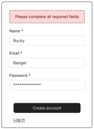
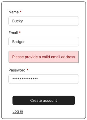
Place error messages close to errors for better visibility and user experience.
6. Test your website
Learn how to evaluate the accessibility of a website or webpage using automated checkers and manual testing processes.
Interaction design
Good interaction design creates meaningful experiences, and considering accessibility ensures these experiences are inclusive and navigable for everyone. When considering the workflows your website supports, keep these questions in mind:
- What can a user accomplish with a mouse or touch gestures?
- What visual cues do we use to signify importance or interactions?
- Are these perceivable and operable for everyone?
This is an accordion element with a series of buttons that open and close related content panels.
Keyboard accessibility
Some users are physically unable to use a mouse and might be navigating through the page using a keyboard only.
Testing a website with a keyboard requires no special tools or skills, just use the Tab key to navigate, without the mouse. As you do this, consider these questions:
- Is a visual indication of keyboard focus present at all times?
- Can you access all features?
- Can you operate all controls?
- Is it reasonably easy to tell where you are on the page?
- When new content is added to or exposed on the page, can the user act on it?
Non-interactive content (for example, plain text and headings) should not be focusable with keyboard alone. Screen readers will still include plain text in the reading order, so there’s no need to make that content focusable.
Beware of completely trapping focus at any point. Watch out for autocomplete widgets, where keyboard focus may get stuck. Focus can be temporarily trapped in specific situations, such as displaying a modal, when you don’t want the user interacting with the rest of the page — but you should aim to provide a keyboard-accessible method of escaping the modal as well.
Hover interactions
In addition to visual and auditory feedback, users who rely on keyboard navigation must also be able to access and manipulate updated content if required. Additionally, any time you have a hover event — “:onhover” — ensure that you pair it with a focus event — “:onfocus” — so that either action takes users to the same place.
Accessible menus
Website navigation menus often include dropdown or flyout menus, where submenus are hidden by default and appear visibly when mouse users hover over or click a top-level menu item. These sorts of menus can present major accessibility challenges for many groups of users unless they are coded properly. Accessibility specialists have explored this problem in depth, with recommendations.
The UW Theme for WordPress includes an accessibility-designed navigation menu, and the university encourages all website owners to use it.
Accessible forms
Make your online forms easy for everyone to use. Give each form field a clear and accurate label or prompt. People who see the form can tell which label goes with which box, but screen reader users can’t unless you connect each label to its box in the form’s code. This helps all users understand what information to enter where.
Opening in a new tab or window
When a link or button on your website will load new content or take the user to a new page, load new content in the same tab. This can help avoid disorienting users by moving their focus into a new window or tab.
There are some exceptions, for example if a user would lose progress in a form by loading new content or if the user needs to login or verify their identity while performing an action. In this case, warn users with an ARIA label or link text that the content will open in a new tab or window.
Content layout and ARIA landmarks
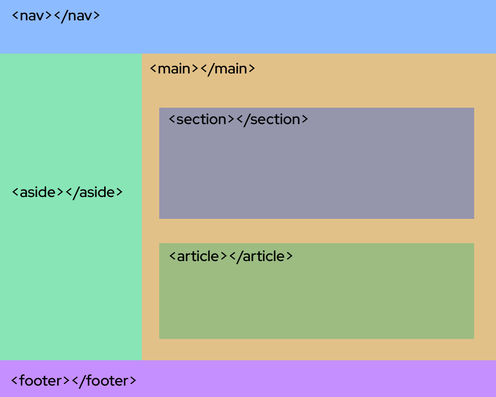
Designate clear and obvious landmarks on your page to make your content easily accessible and recognizable. Make sure you use semantic HTML as much as possible since it has most of the tagging structure you need to provide context and relationship in your code.

Accessible Rich Internet Applications (ARIA) landmarks
ARIA landmarks are attributes you can add to page elements to define areas like the main content or a navigation region.
Only use ARIA when HTML elements do not provide everything you need. Unfortunately, some browsers do not support ARIA tags, so it is best practice to use the commonly supported ones and use less of the browser-specific tags. The W3C’s WAI-ARIA Authoring Practices Guide (APG) gives examples of how to apply accessibility semantics to standard design patterns, forms and other interactive elements.
aria-labelledby
- Establishes relationships between objects and their labels
- Value should be 1 or more element IDs, referring to elements with the text for labeling
aria-describedby
- Indicates the IDs of the elements that describe the object
- Use to establish a relationship between widgets or groups and text that describes them
aria-label
- Defines a string that labels the current element
- Use when a text label is not visible on the screen
Reflow and magnification
Users with low vision may need to magnify content in order to use the website. When testing magnification, try magnifying the content up to 400%. Content should not overlap, cut off, or lose functionality as you magnify.
Ensure that all interactive elements remain interactive as you magnify the screen. This is especially important for menus that collapse or relocate at higher magnifications.
Error handling
Handling error messages accessibly means making sure that errors are clear, specific, and easy to locate. Error messages should appear close to the form fields and use simple, concise language to describe the issue and how to correct it. Providing real-time validation feedback can help users correct errors as they occur, enhancing the overall user experience. Errors should also be announced to screen reader users as they appear, whether in real-time or after a page load, especially when the errors prevented an event from happening (like submitting a form).


Test your website
You can use automated web accessibility checkers like Lighthouse and WAVE to find certain types of accessibility barriers. These tools scan the code of webpages and then provide simple error reporting that may help you to identify and fix some accessibility issues.
While automated testing is a great first step, manual testing is always needed to determine whether a digital resource is accessible.
For more information, read this guide on how to test your websites and webpages for accessibility.
The Center for User Experience
At the Center for User Experience, we are committed to working with you to make digital spaces more accessible, usable and inclusive for all students, faculty and staff at UW–Madison. We help the university follow its Digital Accessibility Policy by offering free evaluation and consultation services to all UW–Madison community members. For guidance on complying with digital accessibility requirements, visit Digital accessibility and the Americans with Disabilities Act (ADA).
Get in touch
- Meet with us: Book a quick chat with one of our team members to ask any questions you have.
- Start a project with us: We support accessible design and development. Fill out our Let’s Connect form to begin working with us on your project or to request an accessibility evaluation.
- Email us: Not sure if you’re ready to meet? Email us to start talking and figure out what to do next.