Last updated December 9, 2021
How to make complex images more inclusive and accessible.
What are complex images?
Complex images as described by W3.org, contain substantial information — more than can be conveyed in a short phrase or sentence. This guide will show examples of descriptions and alternative formats for complex images. Alternative formats give multiple ways to intake information and content, aligning course materials with the goal of universal design for learning and with the POUR principles of accessibility.
POUR principles of functional accessibility
“Anything you see (visual user experience), you should be able to hear (auditory user experience). Anything you hear, you should be able to see.”
According to the Web Content Accessibility Guidelines (WCAG 2.0), accessible information is:
- Perceivable (I know it is there)
- Operable (I can manipulate it)
- Understandable (I know what is being communicated)
- Robust (it works with my technologies)
In addition to websites, most other information technology can be made accessible by applying these principles.
When creating course content, examine it through this lens when getting started. Regardless of the student’s abilities or disabilities, will all my students be able to perceive that your content exists, navigate or operate the content per its intended use, understand all of the content, and have robust content that can be accessed through their assistive technologies without requiring assistance?
Using color and pattern
According to the Web Content Accessibility Guidelines (WCAG 2.0), colors need to have sufficient contrast and cannot be the sole means of communicating information. The following sections will discuss accessible ways to use color and pattern in data visualizations, including considerations for contrast, white space, and pattern.
Your color scheme should have a high color contrast ratio to meet WCAG AA or AAA color contrast accessibility standards. Your color scheme should also be accessible to people who are colorblind. Learn more about color palettes and accessibility features for data visualization. Here are some additional steps you can take to ensure color contrast accessibility:
- Use a color contrast checker to ensure high enough contrast ratios
- Use tools such as Colorsafe to create an accessible color palette
- Use a simulator such as Coblis to see what your color scheme might look like to someone who is colorblind
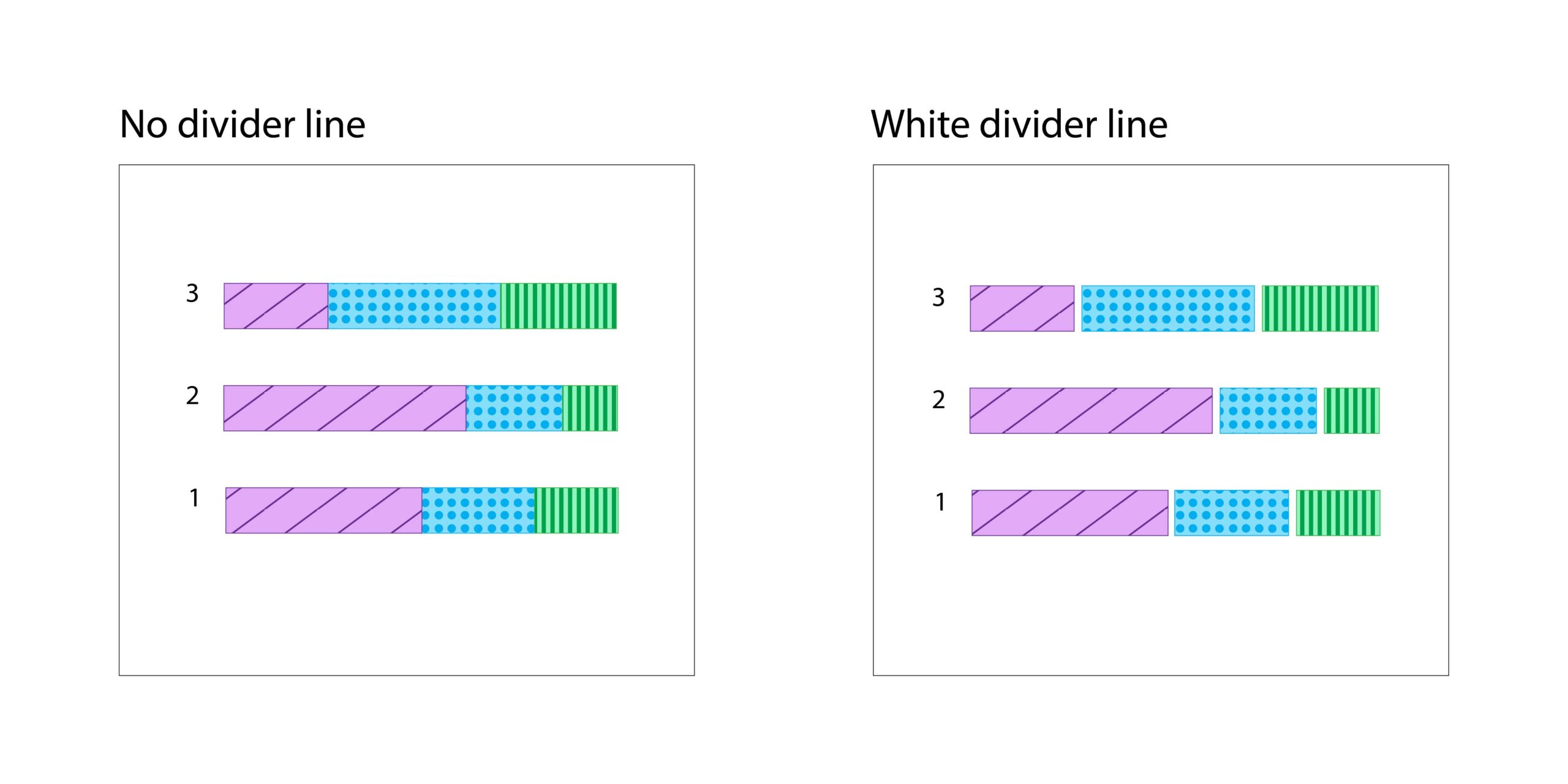
White space can help distinguish elements of your visualization, and prevent confusion based on color. The following bar charts illustrate the difference between a chart with no divider line, and a chart that uses a white divider line to distinguish all three colors in the bar chart.
Trying to communicate an aspect of your data exclusively through color means that some people might miss the information that you are trying to convey.
- Do not communicate exclusively with color. For example, you can add patterns and shapes to graphs to make items distinguishable without having to rely on colors. How to add patterns to graphs with D3.
- Have an accessible legend that explains the use of color in your graph. How to create an accessible legend with D3.
Complex image and text description examples
A heading example, an alternative text, text description, and an alternative format to best match the complex image.
| Complex Image | Heading | Alternative text | Good Text description | Poor Text Description |
|---|---|---|---|---|
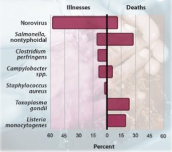 |
Figure 1: Top pathogens contributing to domestically acquired foodborne illnesses and death, 2000-2008 | “Figure 1: Graph of percentage of illness and death associated with certain pathogens. See details in Figure 1 description [tell user whether description is in surrounding text or if there is a unique link to follow for a description]” src=”image2.jpg”> | Figure 1:Graph shows the percentages for the top pathogens contributing to domestically acquired foodborne illnesses and deaths between the years 2000 and 2008. It is important that you are aware of the Norovirus pathogens in particular, as it is really the only pathogen of any concern that is related to Donkey Cheese production. Known as “Winter Vomiting Bug” in the UK and elsewhere, Norovirus can be nasty but causes very few deaths — about 12% of all foodborne illness deaths. | Bar graph showing top pathogens contributing to domestic foodborne illness. |
Alternative Format Option – Data Table
Top Pathogens contributing to domestically acquired foodborne illnesses and deaths, 2000-2008
| Type of illness | illnesses (approximate) | deaths (approximate) |
|---|---|---|
| Norovirus | 58% | 12% |
| Salmonella, nontyphoidal | 11% | 28% |
| Clostridium perfringens | 10% | 0 |
| Campylobacter spp. | 8% | 6% |
| Staphylococcus aureus | 1-2% | 0 |
| Toxoplasma gondii | 0 | 20% |
| Listeria monocytogenes | 0 | 18% |
Source: Pennsylvania State University
A heading example, an alternative text, text description, and an alternative format to best match the complex image.
Read more about creating accessible flow charts and accessible image maps.
| Complex Image | Heading | Alternative text | Good Text description | Poor Text Description |
|---|---|---|---|---|
 |
Figure 2: Photosynthesis and cellular respiration | “Figure 2: This graphic shows the process of photosynthesis. See more details in the Figure 2 description…[tell user whether description is in surrounding text or if there is a unique link to follow for a description]” src=”image2.jpg”> | Figure 2: A graphic showing the process of photosynthesis and cellular respiration. Light Energy leads to photosynthesis. Photosynthesis leads to carbohydrates and oxygen. Carbohydrates and oxygen leads to cellular respiration Cellular respiration leads to energy released, water vapor and carbon dioxide. Water vapor and carbon dioxide lead back to photosynthesis, and the cycle continues. | Graphic showing the process of photosynthesis. |
Alternative Format Option – List
A diagram shows the process of photosynthesis and cellular respiration.
- Light Energy leads to photosynthesis.
- Photosynthesis leads to carbohydrates and oxygen.
- Carbohydrates and oxygen lead to cellular respiration.
- Cellular respiration leads to energy released, water vapor and carbon dioxide.
Water vapor and carbon dioxide lead back to photosynthesis, and the cycle continues.
A heading example, an alternative text, text description, and an alternative format to best match the complex image.
| Complex Image | Heading | Alternative text | Good Text description | Poor Text Description |
|---|---|---|---|---|
 |
Figure 3: Fluid velocity profile | “Figure 3: An illustration of fluid passing through a tube with the velocity charted on an x and y axis. See details in the Figure 3 description…[tell user whether description is in surrounding text or if there is a unique link to follow for a description]” src=”image2.jpg”> | Figure 3: This illustration shows fluid flowing through a pipe along the x-axis in parallel layers with minimal disruption. Velocity arrows are shorter on the edges, representing a slower velocity vx and longer in the center, representing a faster. The edges of the arrow form a parabola and represent the “velocity profile. | An illustration of a pipe with arrows pointing to the right. Black arrows showing a y-axis and an x-axis. |
Alternative Format Option – Tactile Graphic or 3-D Print
Alternative formats
What are alternative formats?
Alternative formats present printed or electronic documents in different ways in order to ensure everyone has equal access to the information, see the tables on P.7 for lists of complex images and corresponding alternative format options. Persons with disabilities often use adaptive/assistive technologies that require an alternate/accessible form, so the technology can access the information in a specific manner for the user.
Types of alternative formats
This is an accordion element with a series of buttons that open and close related content panels.
Text Descriptions
Text descriptions are a written version of the image provided. It will give content plus context to the image being used in a concise and meaningful way.
Lists
Lists can be used to turn graphs and charts into a more accessible format, being sure to use bullets for unordered lists and numbers or letters to show a process or sequence.
Data tables
Data tables present information in correct reading order from left to right and top to bottom. They include a table caption and headers for the columns and rows.
Tactile graphics
Tactile graphics are a version of the image that a person can touch to understand a process or structure.
Recorded audio
Recorded audio offers a way to hear the content.
Sonification
Sonification is a general term for conveying information or data through non-speech audio — similar to how the term “visualization” expresses the concept of conveying information or data graphically.
Scalable vector graphics
Scalable vector graphics (SVG) files are text-based and can be searched and indexed, this makes them readable by screen readers, search engines and other devices.
EPUB
EPUB, short for electronic publication, is supported by many e-readers and compatible software is available for most smartphones, tablets, and computers.
3D Printing
3D printing offers a low-cost alternative to creating 3D models that can be touched to understand a process or structure.
Haptic technology
Haptic technology creates touchable or vibrating responses to actions the user takes.
Writing text descriptions
Text descriptions are the most basic alternative format for making a complex image more accessible and inclusive. Text descriptions are not the same as alternative text. Text descriptions include the content of the image and also give the context of the image in relation to the rest of the course materials and subject matter. Alternative text is the literal content of the image provided. As defined in WCAG 2.0 guideline 1.1.1 “All non-text content that is presented to the user has a text alternative that serves the equivalent purpose.”
When you begin writing your text description, use these prompts from the Diagram Centers’ general guidelines and reference the guide if more examples are needed:
- Context is key-Survey the text surrounding an image to understand how it fits into the bigger picture
- Consider your audience-Reference examples and details that the reader will understand (this includes objects and attributes used in the description).
- Be concise-Don’t repeat information presented in the main or adjacent texts. Instead, direct readers to existing descriptions, when available (e.g. captions).
- Be objective-Describe only what you see – physical appearances and actions rather than emotions and possible intentions.
- General to specific-Start with high-level context, and then drill down to details that enhance understanding. This provides the reader with options about how much information to read.
- Tone and language-Write out abbreviations and symbols to ensure proper pronunciation by screen readers.
There is an option to describe content and context of an image in the alternative text field if it can be done in less than 125 characters, but that is usually not the case when working with complex images and is not a best practice.
Use the Poet Training Tool:When to describe an image resource for more insights.
Resources for writing text descriptions provided by the Diagram Center
Recommended alternative formats for specific complex images
Charts
| Type | Pie Chart | Diagram Chart |
|---|---|---|
| Alternative Formats |
|
|
Graphs
| Type | Bar Graphs | Line Graphs |
|---|---|---|
| Alternative Formats |
|
|
Others
| Type | Illustrations | Math and Graphics | Maps |
|---|---|---|---|
| Alternative Formats |
|
|
|
The Center for User Experience
At the Center for User Experience, we are committed to working with you to make digital spaces more accessible, usable and inclusive for all students, faculty and staff at UW–Madison. We help the university follow its Digital Accessibility Policy by offering free evaluation and consultation services to all UW–Madison community members.
Get in touch
- Meet with us: Book a quick chat with one of our team members to ask any questions you have.
- Start a project with us: We support accessible design and development. Fill out our Let’s Connect form to begin working with us on your project or to request an accessibility evaluation.
- Email us: Not sure if you’re ready to meet? Email us to start talking and figure out what to do next.